How to Build Native Dashboards in Notion - Notion Dashboard View
Dashboards are metrics-driven visualizations that help you and your team make choices based on data, or simply consult analytics about your work and life endeavors. Insights based on real data are valuable because they present the truth of the past and current situations, which are otherwise obfuscated by cognitive distortions and biases. You can see the truth more clearly and make new choices accordingly.
A dashboard is only as useful as the metrics chosen and the quality of the underlying data. The Notion Dashboard block uses data sources in your Notion workspace. So, there must be an underlying solid and well-maintained structure in order to surface the data you wish to visualize.
The famous saying in data science fields applies: “garbage in, garbage out”. With inaccurate/corrupted/non-relevant data (garbage in), you can’t get meaningful visualizations representing the truth (garbage out). So, you must work on the foundations first before embellishing the surface area — just like the foundations of a house are the first and one of the most important things that determine the house’s structural integrity over decades.
That said, AI is shifting this equation. Because of the text-based retrieval of LLMs and their increased accuracy of output, the degree of rigor of the data infrastructure can be lower, as long as there is data somewhere that is retrievable. For example, an AI agent can query a messy database and sometimes still return useful insights, whereas a chart view of the same data would be unreadable.
Many teams struggle to build useful dashboards because they focus on visuals before defining what matters. Define and agree on the key questions and metrics first, which will evolve as your strategy does.
Then check whether the data you need already exists — and where — or if groundwork is needed first. At that point, you build the necessary data sources to store the data, possibly connected across multiple software tools via their APIs (application programming interface) or MCPs (model context protocol).
Notion is a workspace many teams already use for project management, documentation, and collaboration. Native dashboards to gain insights about internal operations can be powerful if you don’t already have them, or if what you have is broken. You could track team members’ capacity to take on additional projects/tasks, team productivity, or use Notion as a KPI tracker for your business, where every week, each team member responsible for specific KPIs (key performance indicators) tracks them (or this process could be automated). Over time, you get a wealth of historical insights to inform your decisions and strategy.
How It Works
The native Dashboard block in Notion is available on the Business plan and above. You can find out more about Notion pricing plans here. If you are a startup, you are eligible for a 3-month free trial on the Business plan by using this link.
Dashboard is a block and a data source view in Notion. This means you can create a Dashboard on any page via the dedicated slash command, or as a view in any database or data source page layout. Notion AI Agent can also create and edit dashboard views based on your written instructions via chat.
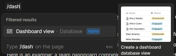
The “Dashboard view” slash command you can use on any Notion page.
The dashboard block supports multi-column layouts with metric cards, charts, and all other available Notion data source views. One dashboard view can contain visualizations from multiple data sources. A data source in Notion is a table as part of a database (i.e., a container of tables). You can only include data source views in a dashboard. It is not possible (currently) to include text and any other block that is not a data source view.
There is an edit mode, and a view mode, separate from each other and applicable via a dedicated button at the top right corner of the dashboard. Edit mode allows you to make edits to the dashboard, while view mode “locks” the dashboard so that you can only view and filter/sort the whole dashboard or specific views, but are not overwhelmed by all the editing options. This is a great feature, in my opinion, because often I just want to view the data and not face all the available editing options and popup menus.
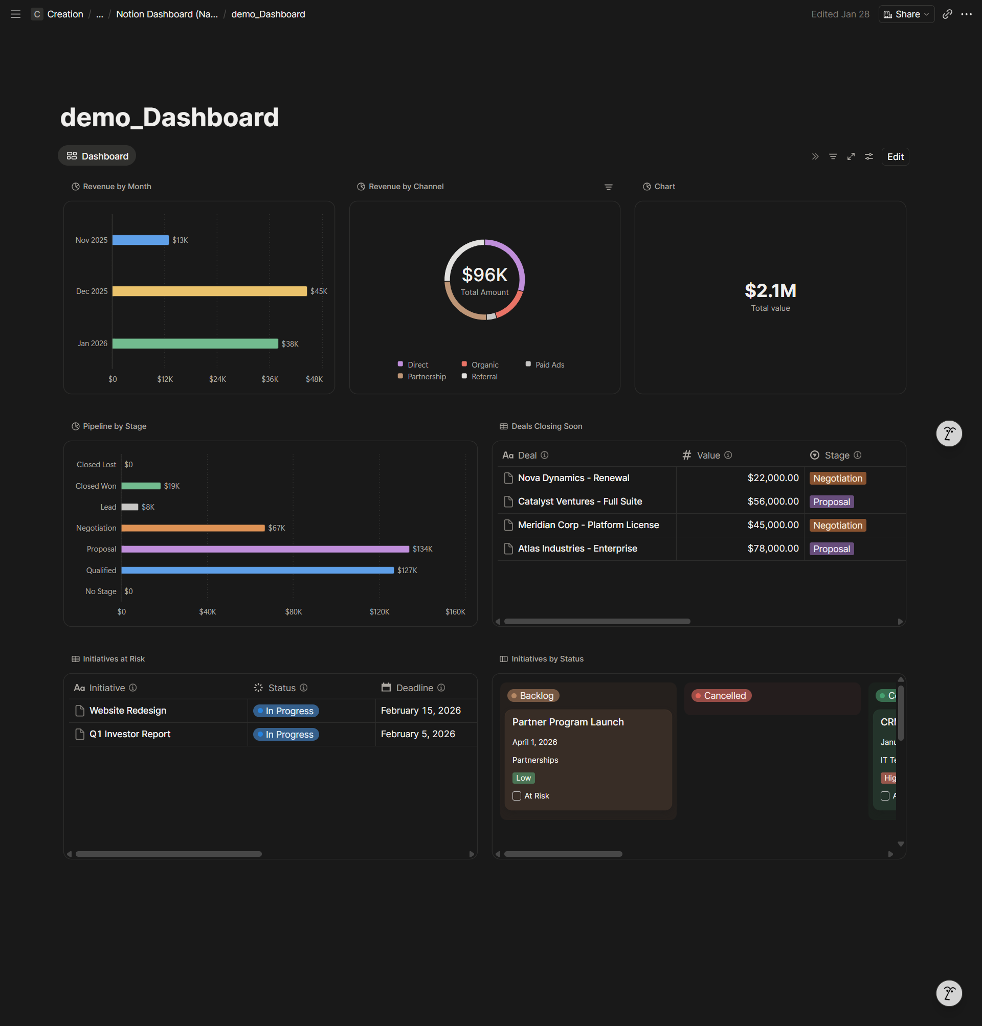
Here is an example: a team dashboard combining sales data and project status in one place.
Watch the video for a full walkthrough
Conclusion
Dashboards shape the stories you tell yourself about the past, present, and future. Start with the right questions — What's our capacity? Are we on track? — and build the infrastructure to answer them.
I specialize in building dashboards and scalable data infrastructure. To learn more and inquire about how we can work together, visit my business site.